Brand kit
Logos, colours and type for writing about QWED, building on it, or putting it on a slide. Everything here is free to use when referring to the project.
Logo
The mark is a pangolin curled up inside a pipe. QWED sits in the pipe between a model and production, and a pangolin curls into armour when something is wrong.










Using the logo
Do
- Keep clear space around the logo at least as wide as one pipe stub.
- Keep the mark at least 24 px tall, and the lockup at least 20 px tall.
- Use a cobalt or ink logo on light backgrounds, and a white one on cobalt, navy or dark backgrounds.
Please don’t
- Stretch, rotate, outline or add effects to the logo.
- Colour it green, amber or red. Those colours belong to verdicts.
- Redraw the wordmark in another typeface, or separate the pipe stubs from the pangolin.
- Use the logo in a way that suggests QWED endorses your product.
Mascot
The pangolin is QWED’s mascot. Pangolins curl into armour when threatened, and QWED fails closed: when a claim can’t be proven, it curls up. Each pose stands for one decision. Draw it in a single ink line, the same weight as the logo, and only colour it with its verdict.
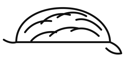

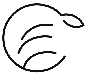

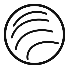

The same three poses run the animation on the Why QWED page, where a claim travels through the pipe and the pangolin reacts to its verdict.
Colour
QWED uses one brand colour, cobalt, on calm neutrals. Green, amber and red are reserved for the three verdicts, so they always mean something.
Brand
- Cobalt
#2340D9The one brand colour: buttons, links, the hero - Navy
#0F1530Utility bar, footer and feature cards - Cobalt tint
#E3E8FCHighlighted cards - Cobalt wash
#EEF1FDIcon tiles, hover states, code
Neutrals
| Token | Light | Dark |
|---|---|---|
| Ink | #111111 | #F2F2F2 |
| Page | #F4F5F7 | #0C0D11 |
| Card | #FFFFFF | #16181F |
| Muted | #5C5C5C | #A3A3A3 |
| Rule | #E3E3E3 | #2A2A2A |
Verdicts
| Verdict | Light · fill / text | Dark · fill / text |
|---|---|---|
| Verified | #1A7F4B / #176F42 | #4CC38A / #62CF9A |
| Unverifiable | #B26B00 / #8F5600 | #F0B44C / #F4C46E |
| Blocked | #C3271D / #B0231A | #FF6B5E / #FF867B |
Text colours are a step darker (light theme) or lighter (dark theme) than the fills, so they pass WCAG AA contrast as body text.
Type
Shape and icons
- Corners: cards are rounded at 22 to 28 px, buttons and tags are fully rounded.
- Icons: from Lucide (ISC licence), drawn with a 2 px stroke and used at 14 to 26 px, usually on a cobalt wash tile.
The name
- Write QWED in capitals. Not Qwed or qwed, except in package names such as
qwed-finance. - Use the results as written: verified, unverifiable, blocked, and always pair them with the admission decision, ADMIT or DENY. Never show “verified” on its own.
Questions about using the brand: support@qwedai.com.